Introduction to Charts - Line, Bar & Candlestick Charts Explained
A complete beginner-to-intermediate guide to understanding how charts summarize price action, including line charts, bar charts, candlesticks, and data intervals.
Introduction To Introduction to Charts - Line, Bar & Candlestick Charts Explained

Charts are where technical analysis begins. Before indicators, before signals, before any system - there is a chart. Understanding how different chart types encode price data changes how clearly you can read what the market is actually doing.
Why Charts Exist
Charts are the foundation of technical analysis because they transform raw numerical price data into visual structure. While a spreadsheet might show thousands of price records, the human brain processes patterns visually far more efficiently than through rows of numbers.
Every trade in a market represents an agreement between buyers and sellers. A chart captures those agreements over time. When plotted sequentially, price movement reveals rhythm, expansion, contraction, acceleration, hesitation, and exhaustion.
Charts are not just pictures - they are structured summaries of supply and demand.
They allow analysts to:
- Recognize trend direction quickly
- Detect shifts in momentum
- Identify volatility expansion
- Spot consolidation zones
- Observe psychological turning points
Without charts, technical analysis would not exist. Indicators, oscillators, and overlays are all built on chart data.
Charts do not predict the future. They organize the past in a way that improves decision-making.
Key Takeaways
- Charts convert numbers into structure
- They visualize supply and demand
- They highlight patterns humans detect naturally
- They form the base of all technical tools
- Understanding chart construction prevents misinterpretation
The Four Core Price Points (OHLC)
All advanced charting begins with four basic data points collected over a specific time interval.
These are:
- Open - the first trade in the interval
- High - the highest price reached
- Low - the lowest price reached
- Close - the final trade in the interval
Together, these four numbers summarize what happened during that period.
The relationship between open and close tells us directional bias. The distance between high and low tells us volatility. The position of the close within the range tells us conviction.
For example:
- Close near the high → buyers dominated
- Close near the low → sellers dominated
- Large range → high volatility
- Small range → compression
These four data points are the building blocks of both bar charts and candlestick charts.
Even the simplest line chart is usually built from the close.
Understanding OHLC is critical because:
- Indicators derive from them
- Patterns are defined by them
- Trend shifts are detected through them
Without knowing what data is being displayed, traders risk drawing incorrect conclusions.
Core Insights
- OHLC summarizes an entire time interval
- Each point carries structural meaning
- Volatility and conviction can be inferred
- All advanced charts are built from these values
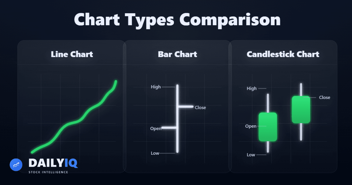
What Is a Line Chart?
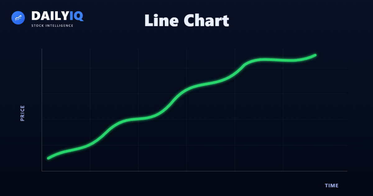
A line chart is the simplest chart type. It connects one price per time interval - usually the closing price - with a continuous line.
Although it appears basic, it serves an important purpose: clarity.
By focusing only on closing prices, a line chart removes intraday noise and highlights overall direction. It sacrifices detail for smoothness.
This makes line charts particularly useful when analyzing:
- Long-term trends
- Index performance
- Multi-year structural moves
- Macro-level analysis
Because only one data point is used per interval, volatility inside the period is hidden. This is both a strength and a limitation.
Strength: it simplifies the story. Limitation: it hides internal movement.
Line charts are often preferred by investors who care about direction rather than intraday battle.
When to Use Line Charts
- Studying long-term movement
- Comparing asset performance
- Identifying macro trends
- Avoiding short-term noise
Limitations
- Does not show opening price
- Does not show volatility range
- Cannot reveal intraday reversals
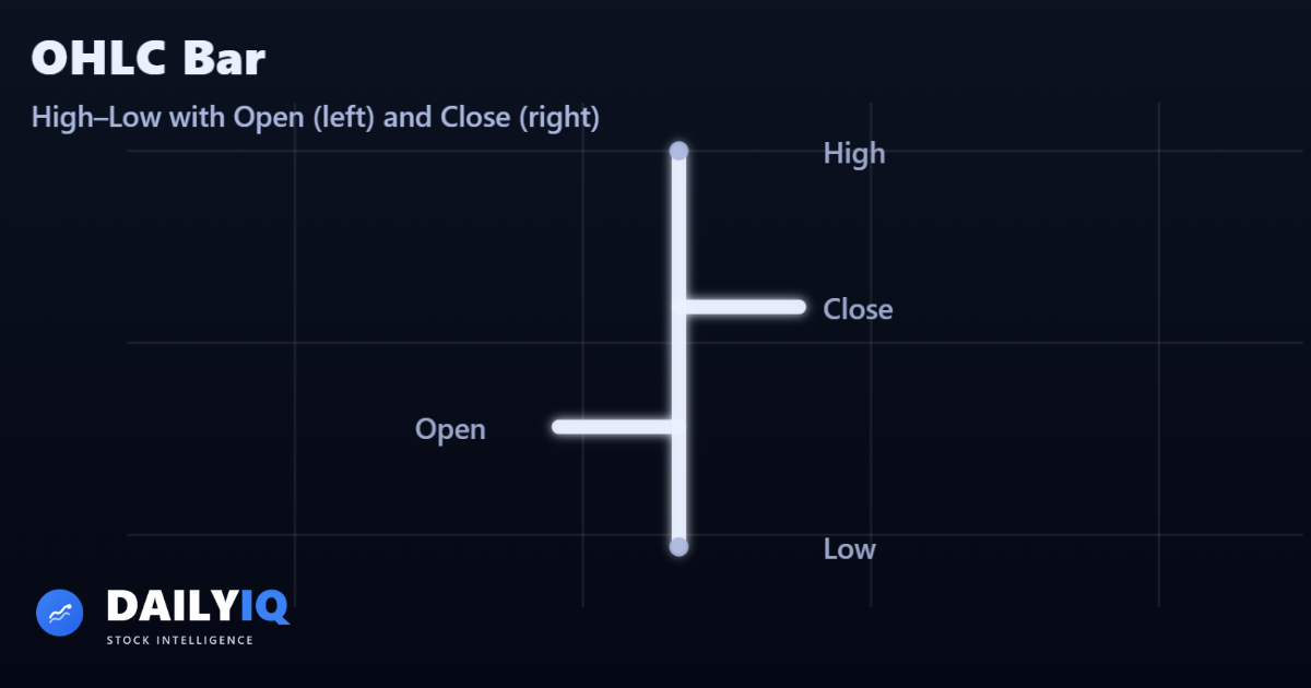
What Is a Bar Chart?
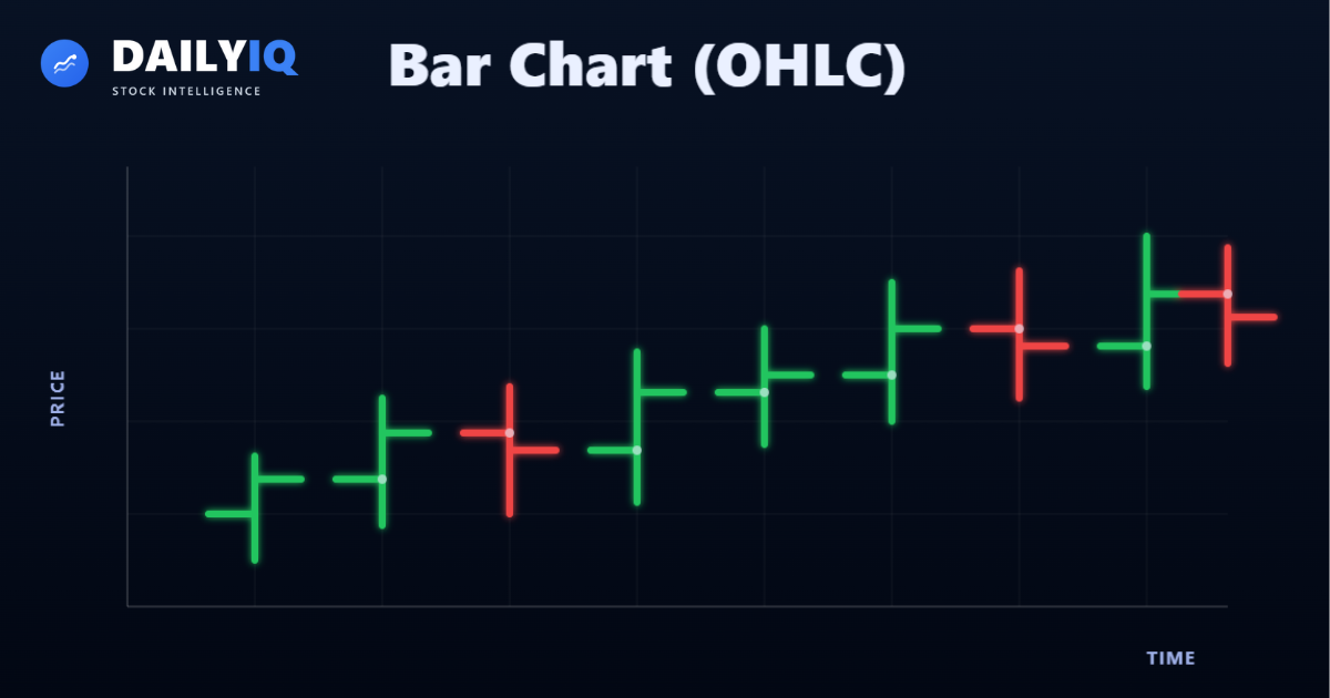
A bar chart expands upon the line chart by incorporating all four OHLC price points.
Each vertical bar represents one time interval.
The components are:
- Top of bar → High
- Bottom of bar → Low
- Left tick → Open
- Right tick → Close
This structure provides significantly more information than a line chart.
Bar charts allow traders to evaluate:
- Intraday volatility
- Gap behavior
- Directional strength
- Reversal attempts
A longer vertical bar indicates greater range (volatility). A short bar suggests compression.
The relationship between the open and close can signal strength or weakness.
For example:
- Close above open → bullish session
- Close below open → bearish session
Bar charts balance information and simplicity. They are highly respected in professional trading environments.
Advantages
- Displays full range
- Shows open and close
- Reveals volatility
- Better for active trading
Limitations
- Less visually intuitive than candles
- Pattern recognition slightly harder
What Is a Candlestick Chart?
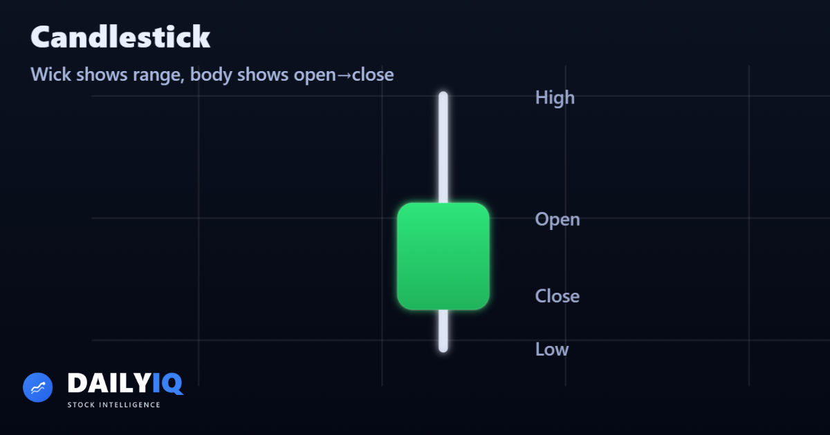
Candlestick charts present the same OHLC information as bar charts but in a more visually intuitive format.
Each candle contains:
- Real body → difference between open and close
- Upper shadow → high to body
- Lower shadow → low to body
If close > open → bullish candle If close < open → bearish candle
Candlesticks make pattern recognition easier because:
- Body size shows conviction
- Shadow length shows rejection
- Color differentiates bias
Large bodies suggest strong directional control. Long upper shadows suggest selling pressure. Long lower shadows suggest buying support.
Candlestick charts are widely used because they integrate price structure and psychology in one visual form.
Why Traders Prefer Candlesticks
- Easier pattern recognition
- Clearer trend shifts
- Emotional behavior visible
- Strong visual contrast
Limitations
- Can become cluttered on small intervals
- Still subject to noise
Data Intervals
Charts can be constructed using different time intervals. This is called the --data interval--.
Common intervals include:
- 1-minute
- 5-minute
- 10-minute
- Hourly
- Daily
- Weekly
- Monthly
Smaller intervals provide more detail but also more noise. Larger intervals smooth out volatility and emphasize structure.
For example:
A 10-minute chart in a 6.5-hour trading day produces 39 candles. A daily chart condenses that same activity into one candle.
Both describe the same day - but at different resolutions.
This concept reflects the fractal nature of markets. Patterns repeat across timeframes, but clarity varies.
Smaller Intervals
- More detail
- More volatility
- More false signals
Larger Intervals
- Smoother trends
- Less noise
- Clearer macro structure
Traders choose intervals based on time horizon.
Match Chart Type to Your Question
Line charts answer "which direction?" Candlestick charts answer "how did the session behave?" Bar charts give you the same OHLC data with a more compact footprint. Choose based on what you are trying to see - use line for macro trend, candlesticks when entry context matters.
Time Interval Changes Everything
The same asset on a 5-minute chart looks completely different from a weekly chart. Neither is wrong - they answer different questions. Start with the higher timeframe to establish trend and structure, then drop to a lower timeframe for timing. Confusing the two is one of the most common beginner mistakes.
Candle Bodies Reveal Who Won Each Session
A long green body means buyers dominated from open to close. A small body with long wicks means neither side was in control - indecision. The wick length relative to the body tells you how much of the session's range was rejected. Reading bodies and wicks together gives a cleaner picture than price alone.
Quick FAQ
Which chart type is best for beginners?
Start with candlesticks because they show OHLC clearly and make momentum shifts easier to see. Use line charts for high-level trend context.
When should I use line charts instead of candles?
Use line charts when you want cleaner long-term direction and less noise. Use candles when entry timing and intraperiod behavior matter.
How do I choose the right interval?
Choose intervals based on holding period. Investors should anchor on daily or weekly charts; short-term traders can refine entries on lower intervals.
Can two intervals show opposite signals at the same time?
Yes. A lower timeframe can pull back while the higher timeframe trend remains intact. That is why top-down analysis is essential.
What is the most common chart-reading mistake?
Treating one candle or one small pattern as decisive without context. Structure, location, and timeframe alignment matter more than any single bar.
DailyIQ publishes market education, score methodology, and research workflows to help users understand what the platform is measuring. Content is for informational purposes only and is not investment advice or a recommendation to buy or sell any security.
Use education with process, not in isolation
See how DailyIQ combines technical indicators, news sentiment, freshness checks, and editorial review to decide what gets surfaced and indexed.
Learn About Investing
These resources can help investors evaluate momentum, volatility, and trend strength when analyzing Introduction to Charts - Line, Bar & Candlestick Charts Explained.
 The Basic Principle of Technical Analysis - The TrendUnderstand how trends form, why they matter, how they are identified, and the core assumptions technical analysts rely on when studying market price behavior.Technical · 12 min read
 Dow Theory History, Theorems, Trends, Confirmation, Volume & CriticismsA comprehensive and original deep dive into Dow Theory, including its historical roots, core theorems, trend classifications, confirmation principles, volume interpretation, criticisms, and modern relevance.Technical · 24 min read
 What Is EMA and How to Read ItLearn how the Exponential Moving Average helps you identify trend direction, momentum shifts, and dynamic support or resistance.Technical · 16 min read