Advanced Chart Analysis: Scaling, Volume, and Comparative Charting Explained
A comprehensive guide to advanced chart construction including arithmetic vs logarithmic scales, dual y-axes, multi-line comparisons, and volume-based charting techniques.
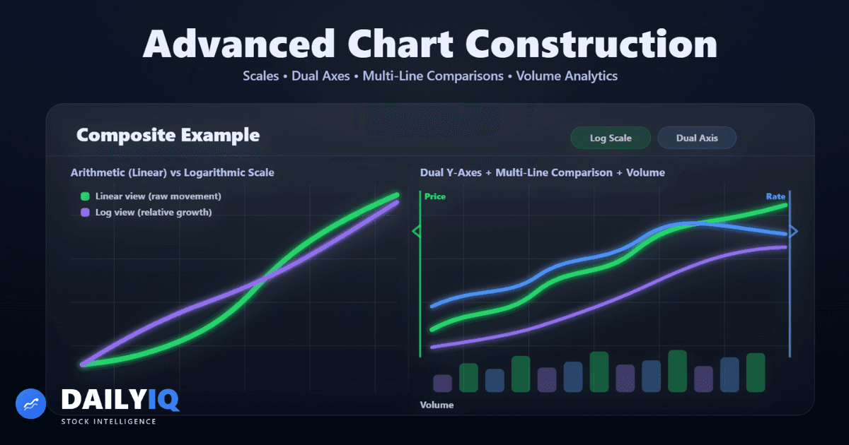
Introduction To Advanced Chart Construction: Scaling, Volume & Comparative Charting

Advanced chart construction goes beyond simple candlesticks or line charts. The way price data is displayed fundamentally shapes how traders interpret trends, risk, and market structure. Two identical price series can appear dramatically different depending on whether a linear or logarithmic scale is used. A breakout may look convincing until volume reveals weak participation. Two indices may seem aligned until scaling exposes divergence.
This guide explores the structural elements that influence interpretation:
- Multi-line comparison charts
- Dual y-axis scaling
- Arithmetic vs logarithmic vertical scales
- Volume integration methods
- Equivolume visualization
- Volume-based interval charts
The goal is not cosmetic adjustment. It is analytical clarity.
Professional analysis requires understanding how chart construction affects perception. Scaling, axes, and volume integration are not minor formatting choices - they are interpretive filters that influence decisions.
Charts are tools. The structure you choose determines the story they tell.
Multi-Line Charts: Comparing Multiple Time Series
Multi-line charts allow analysts to compare several securities or economic variables across the same time axis. Instead of focusing on one asset in isolation, this method highlights relationships, divergence, correlation, and leadership rotation.
For example:
- Comparing S&P 500, Nasdaq, and Dow Jones reveals internal market strength.
- Comparing gold and the US Dollar Index highlights macro relationships.
- Overlaying sector ETFs identifies capital rotation between industries.
The objective is structural comparison - not absolute price comparison. When viewing multiple lines, the analyst evaluates whether assets trend together, whether divergence is forming, or whether one asset leads another.
However, scaling is critical. If price magnitudes differ dramatically, interpretation can be distorted. In such cases, normalization or logarithmic scaling may be necessary.
Best practices:
- Focus on directional alignment
- Avoid cluttering with too many overlays
- Normalize when comparing different magnitudes
- Use log scale for long-term relative performance
Multi-line charts shift analysis from isolated price movement to relational structure.
Dual Y-Axis Charts: Managing Magnitude Differences
When two variables trade at very different levels, plotting them on a single y-axis compresses one series into near invisibility. A dual-axis chart solves this by assigning one variable to the left vertical axis and the other to the right.
Common use cases include:
- Equity index vs bond yield
- Stock price vs macroeconomic data
- Commodity price vs currency index
This preserves visual clarity for both series. However, dual axes must be used responsibly. Manipulating scale ranges can artificially imply correlation. Overlapping lines do not guarantee statistical relationship.
Advantages:
- Preserves readability
- Allows cross-asset comparison
- Maintains proportional emphasis
Risks:
- Can exaggerate relationships
- May visually imply correlation
- Requires clear labeling
Dual-axis charts are powerful analytical tools when scaling integrity is maintained.
Arithmetic vs Logarithmic Scale
Choosing between arithmetic and logarithmic scaling is one of the most important decisions in chart construction.
An arithmetic (linear) scale spaces price levels evenly. A $10 move appears identical whether price is $20 or $200. This works well for short-term analysis where absolute price movement matters.
A logarithmic scale spaces values by percentage change. Equal vertical distance represents equal percentage movement.
Example:
- $10 → $20 (100% gain)
- $50 → $100 (100% gain)
On a log scale, both appear identical in height. On a linear scale, they do not.
When to use arithmetic scale:
- Short-term trading
- Range-bound markets
- Stable price environments
When to use log scale:
- Multi-year charts
- Exponential growth stocks
- Large percentage movements
- Long-term structural analysis
For long-horizon analysis, log scale more accurately reflects investor return and compounding growth.
Always verify which scale is active before drawing conclusions.
Volume Integration and Confirmation
Volume represents participation. Price shows direction - volume shows conviction.
Volume is typically displayed beneath price as vertical bars. Rising price with rising volume suggests strong participation. Rising price with declining volume may signal weakening momentum.
Common interpretations:
- Rising price + rising volume → trend strength
- Rising price + falling volume → potential fragility
- High volume at resistance → possible distribution
- Volume spike at breakout → confirmation
Volume does not independently define trend direction. It confirms or questions existing structure.
Guidelines:
- Compare current volume to historical averages
- Identify abnormal spikes
- Watch for divergence between price and volume
- Use volume as supporting evidence
Without volume, price lacks participation context.
Equivolume Charts
Equivolume charts combine price and volume into a single graphical structure. Instead of fixed-width candles, each bar’s width reflects trading volume while height reflects price range.
High-volume sessions appear wide. Low-volume sessions appear narrow.
This format emphasizes participation intensity without requiring a separate volume pane.
Advantages:
- Instantly highlights heavy trading days
- Integrates price and volume visually
- Useful during accumulation or distribution
Limitations:
- Distorts time spacing
- Less intuitive for beginners
- Harder to compare equal time intervals
Equivolume charts are best used as supplementary tools rather than primary analysis formats.
Volume-Based Interval Charts
Traditional charts use fixed time intervals. Volume-based charts replace time with activity. Each candle represents a fixed amount of traded volume rather than a fixed duration.
When trading activity is high, candles form rapidly. When activity is low, fewer candles appear.
Advantages:
- Emphasizes institutional participation
- Highlights momentum bursts
- Reduces low-activity noise
- Useful for intraday traders
Volume-based charts reveal patterns that time-based charts may obscure during high-volatility sessions.
They reinforce an important principle: participation often matters more than clock time.
Log Scale for Long-Term, Arithmetic for Short-Term
On logarithmic scale, equal vertical distances represent equal percentage moves -- a doubling from $10 to $20 looks the same as a doubling from $100 to $200. On arithmetic scale, they look very different. For any chart spanning years of price history, log scale almost always produces more structurally honest trend lines. For short-term charts where you are trading within a narrow range, arithmetic scale is often cleaner.
Comparative Charts Reveal Divergence Before It Is Obvious
When you overlay two related assets -- an index and a sector ETF, two correlated commodities, or a stock versus its benchmark -- what matters is structural direction, not price magnitude. A sector that is not keeping pace with a rising index is underperforming even if its absolute price is rising. That kind of divergence often signals a rotation or regime shift before either chart makes it obvious on its own.
Volume Validates the Move -- Always Check Participation
A breakout to new highs on average or below-average volume is fragile. The same breakout with a clear volume surge is backed by genuine participation. Advanced chart analysis without volume context is incomplete -- every major structural event should be cross-referenced with whether the market voted for it with meaningful activity.
Advanced Chart FAQ
When should I use logarithmic scaling?
Use log scale for multi-year charts, exponential growth stocks, or when percentage change matters more than absolute price change.
Are dual-axis charts reliable?
They are useful but must be used carefully. Improper scaling can visually imply correlation that does not statistically exist.
Is volume required for all analysis?
Volume is not mandatory but significantly improves confidence assessment and breakout validation.
Are volume-based charts better than time-based charts?
Not universally. They are particularly useful in active trading environments but less essential for long-term structural analysis.
What is the biggest mistake traders make with chart scaling?
Forgetting to check whether the chart is linear or logarithmic, leading to distorted perception of long-term trend strength.
DailyIQ publishes market education, score methodology, and research workflows to help users understand what the platform is measuring. Content is for informational purposes only and is not investment advice or a recommendation to buy or sell any security.
Use education with process, not in isolation
See how DailyIQ combines technical indicators, news sentiment, freshness checks, and editorial review to decide what gets surfaced and indexed.
Learn About Investing
These resources can help investors evaluate momentum, volatility, and trend strength when analyzing Advanced Chart Analysis: Scaling, Volume, and Comparative Charting Explained.
 The Basic Principle of Technical Analysis - The TrendUnderstand how trends form, why they matter, how they are identified, and the core assumptions technical analysts rely on when studying market price behavior.Technical · 12 min read
 Dow Theory History, Theorems, Trends, Confirmation, Volume & CriticismsA comprehensive and original deep dive into Dow Theory, including its historical roots, core theorems, trend classifications, confirmation principles, volume interpretation, criticisms, and modern relevance.Technical · 24 min read
 What Is ATR and How to Use ItLearn how the Average True Range (ATR) measures volatility and helps you set smarter stop losses and position sizes.Volatility · 16 min read
 What Is RSI and How to Read ItLearn how the Relative Strength Index helps you measure momentum and identify overbought or oversold conditions.Technical · 16 min read
 Understanding MACD: A Beginner's GuideLearn how MACD crossovers, histogram momentum, and divergence can help you read trend shifts.Technical · 16 min read
 Introduction to Charts - Line, Bar & Candlestick Charts ExplainedA complete beginner-to-intermediate guide to understanding how charts summarize price action, including line charts, bar charts, candlesticks, and data intervals.Technical · 22 min read